This feature started as a small internal requirement, but very quickly I realized how much impact it actually had. The goal was simple on the surface: allow our admin users to control how reward points convert into currency. But behind that simplicity was a much larger challenge our users were spread across different countries, using different currencies, and often managing multiple accounts at the same time.
Because this feature directly influenced how rewards were valued, even a small mistake could affect a large number of end users. So before jumping into design, I spent time understanding how our internal teams and admin users currently handled these configurations, what confused them, and where errors usually happened.
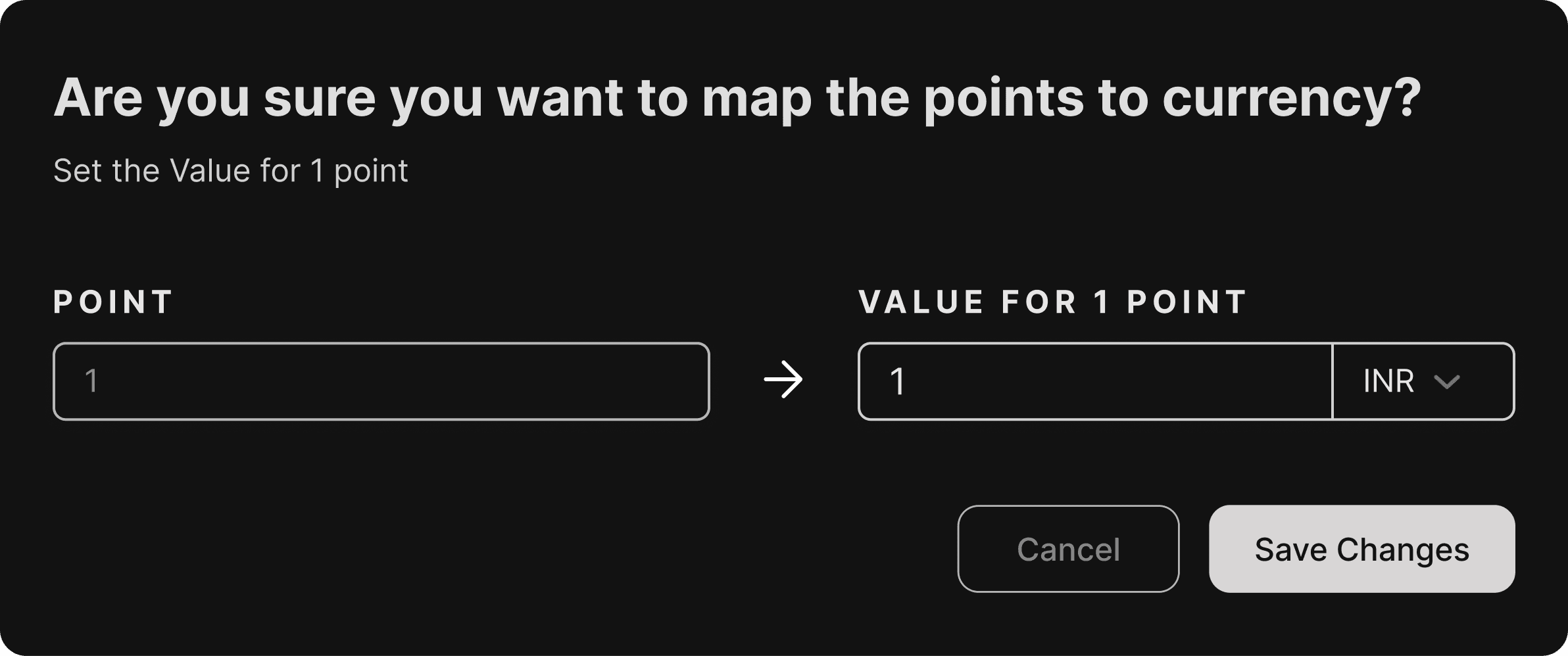
One of the biggest challenges was designing for a global use case. A single user could operate across regions and currencies, which meant the UI had to clearly communicate conversions without overwhelming the admin. The interface needed to make it obvious what was being configured, for which account, and in which currency all without forcing the user to think too hard.
While designing the solution, I also kept our internal teams in mind. This wasn’t a feature only meant to look good; it had to be easily understood by support and operations teams who would regularly use it to customise settings for different clients. With guidance from my senior designers, I focused on keeping the interface clean, predictable, and aligned with our existing design language.
In the end, the feature came together as a simple, functional UI that hid the complexity behind it. Admin users could confidently customize point values for different currencies, internal teams could manage configurations without confusion, and the overall system became more scalable for future use cases.
Even though this feature was small in scope, it reinforced an important lesson for me: internal tools deserve just as much design attention as user-facing features because they quietly power the entire product experience.